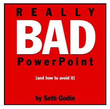
Seth Godin is a friggin genius, in my humble opinion. And I told him so back in 1999. Had I not read his first book, Permission Marketing, I wouldn’t have had the knowledge and jargon I needed to secure a job with 1-800-FLOWERS.COM that got me started online. (He was very courteous in his reply; I have it laying here around somewhere.)
This little ten-page missive changed the way I approach PowerPoint. You must download it. It’s really good, and a quick read.
Here’s my take on it:
* A picture trumps a word every time. Upload a photo. Use the whole page. Talk about the photo and what it means.
* Do NOT write a “deck” so that anyone who missed the meeting can just read the deck and understand everything that went on during your presentation. They didn’t make it? Tough! They want the presentation; they get the presenter because no piece of paper will sell as well as you do.
* Do NOT use clip art or any installed Microsoft background. It shouts, “I’m lazy, I have no sense of style, and I don’t know how to use PowerPoint.”
* You don’t need whole sentences. PowerPoint is just a visual tracking device for those who need something to see while you present. In fact, unless there is a picture, I prefer the slide to be borderline boring. I’d rather have them looking at me than the screen anyhow.
Great pointers. Go ahead and download it now.
…
…

Speak Your Mind